The work, in one line
Turning a platform too big to change into one product.
A platform that finally behaved the same way everywhere — one logic to learn, not a dozen.
A shared language — patterns, tokens, and components — so any team could change a screen without breaking the next.
Best-in-class UX that helped Adform raise investment, reach profitability, and win larger clients.
01 The problem
A product too big to change.
When I joined, Adform was already a massive advertising platform with many engineering teams. The product worked, but it had outgrown its own structure — and that made it slow and risky to evolve. The design department was given an unusual mandate: drive the strategy for turning it into something a team could actually maintain.
- 01
Many teams per screen
A single page was often supported by several engineering teams at once.
- 02
Stakeholder gridlock
Any change meant aligning owners with different priorities and roadmaps.
- 03
No shared language
Design and code had drifted; the same idea was built a different way in each corner.
- 04
Change was expensive
The product had grown faster than the structure underneath it could hold.
02 The answer was a system, not a redesign
A UX framework the whole company could build on.
We didn't restyle the product. We built the thing underneath it: a UX framework that translated strategy and vision into parts teams could reuse. It was powerful enough to answer almost any question about the product — and, crucially, it was used by designers and developers alike to refactor what existed and to build what came next.
- 01
Strategy & vision
A direction for what the product should become, and a case leadership could back.
- 02
Patterns & documentation
Reusable solutions to recurring problems, written down so teams stopped re-deciding them.
- 03
Components & tokens
One library and one set of design tokens — a shared source of truth for design and code.
- 04
Personas & relationship diagrams
Maps of who used the product and how its parts connected, so any question had a place to be answered.

The gameplan, shared by design and code.
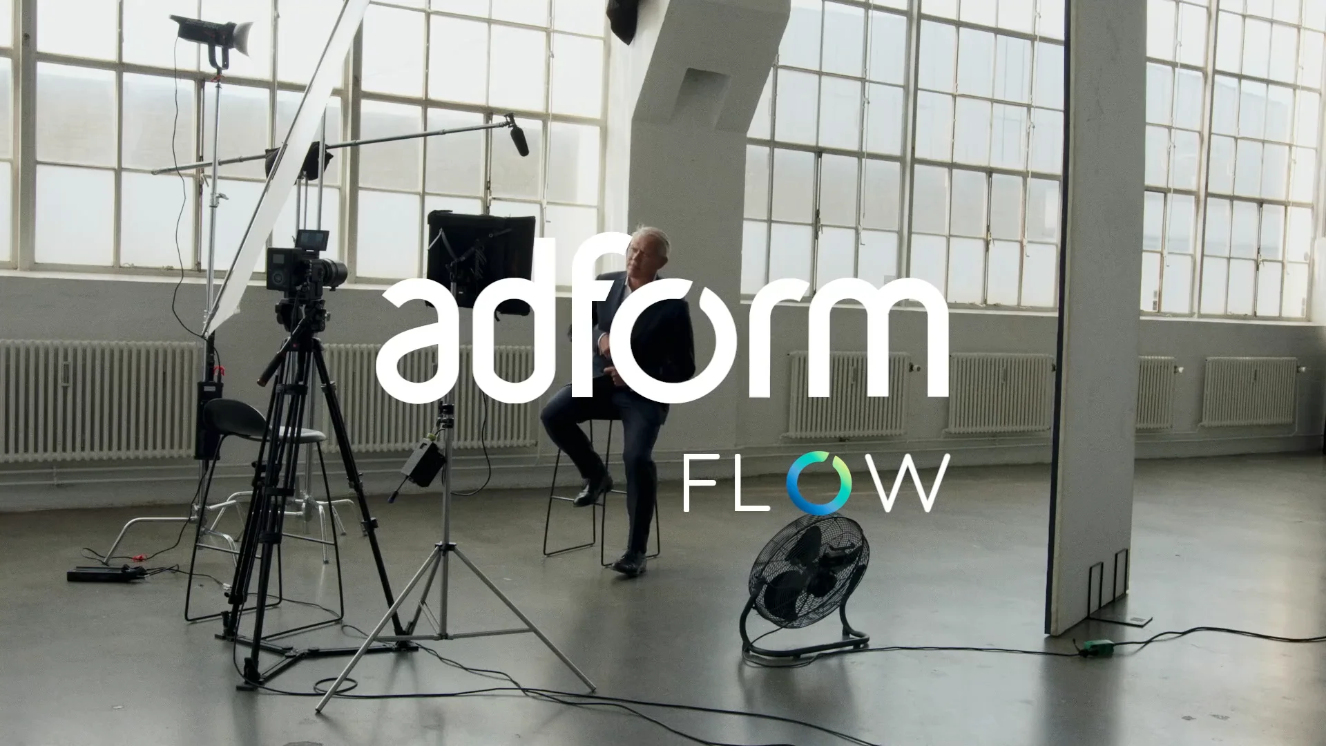
03 What the framework became
Adform FLOW.
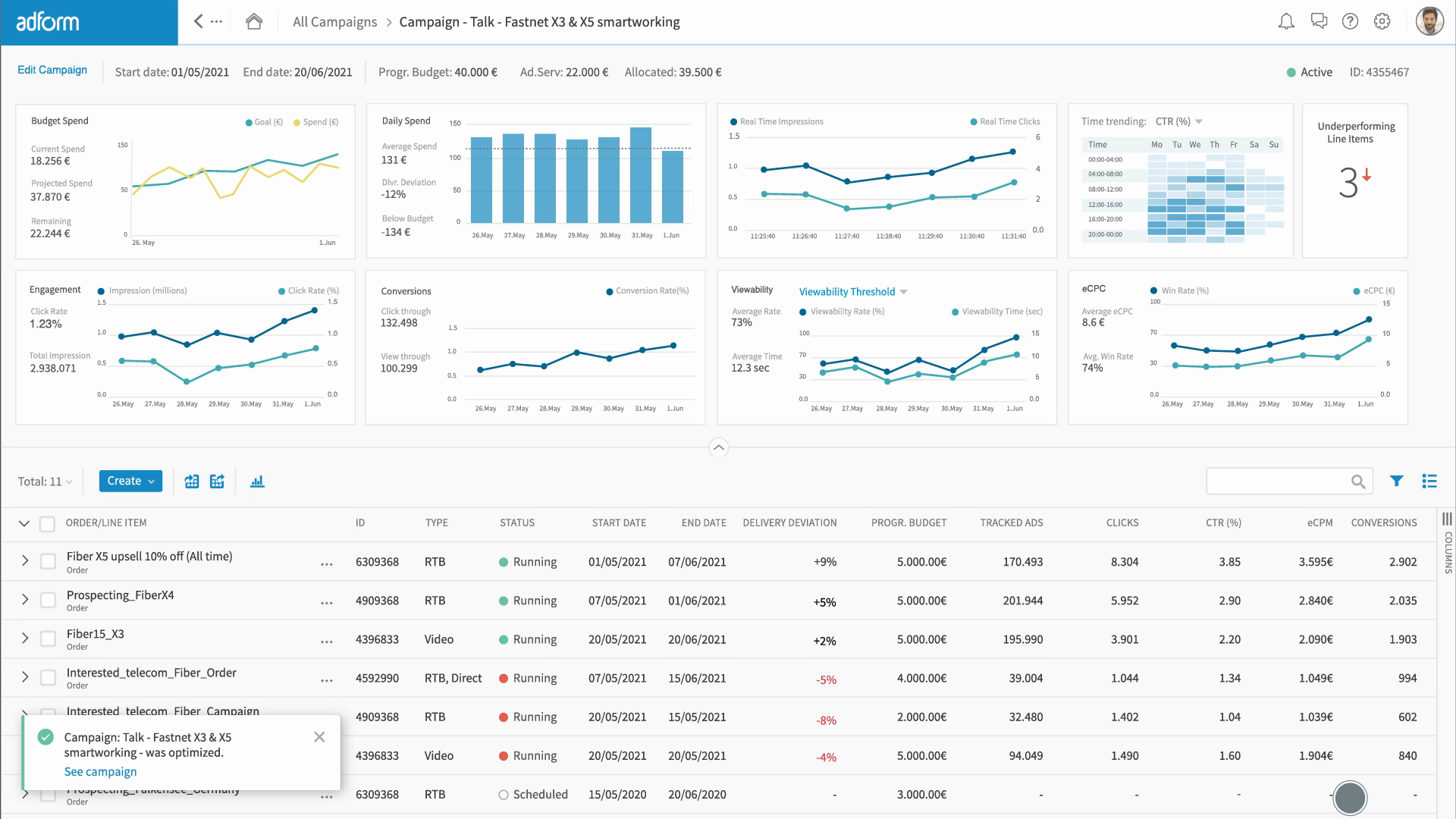
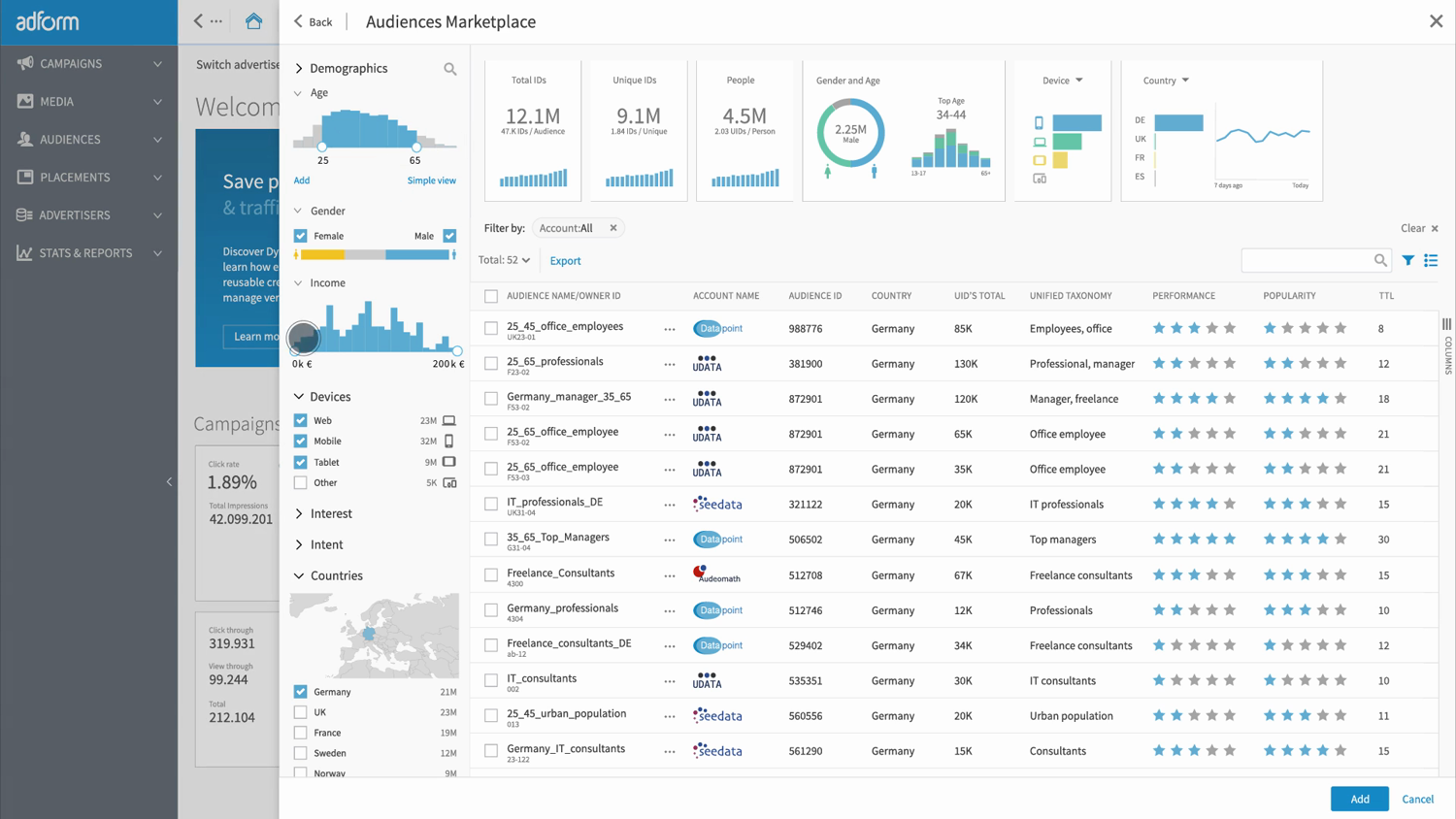
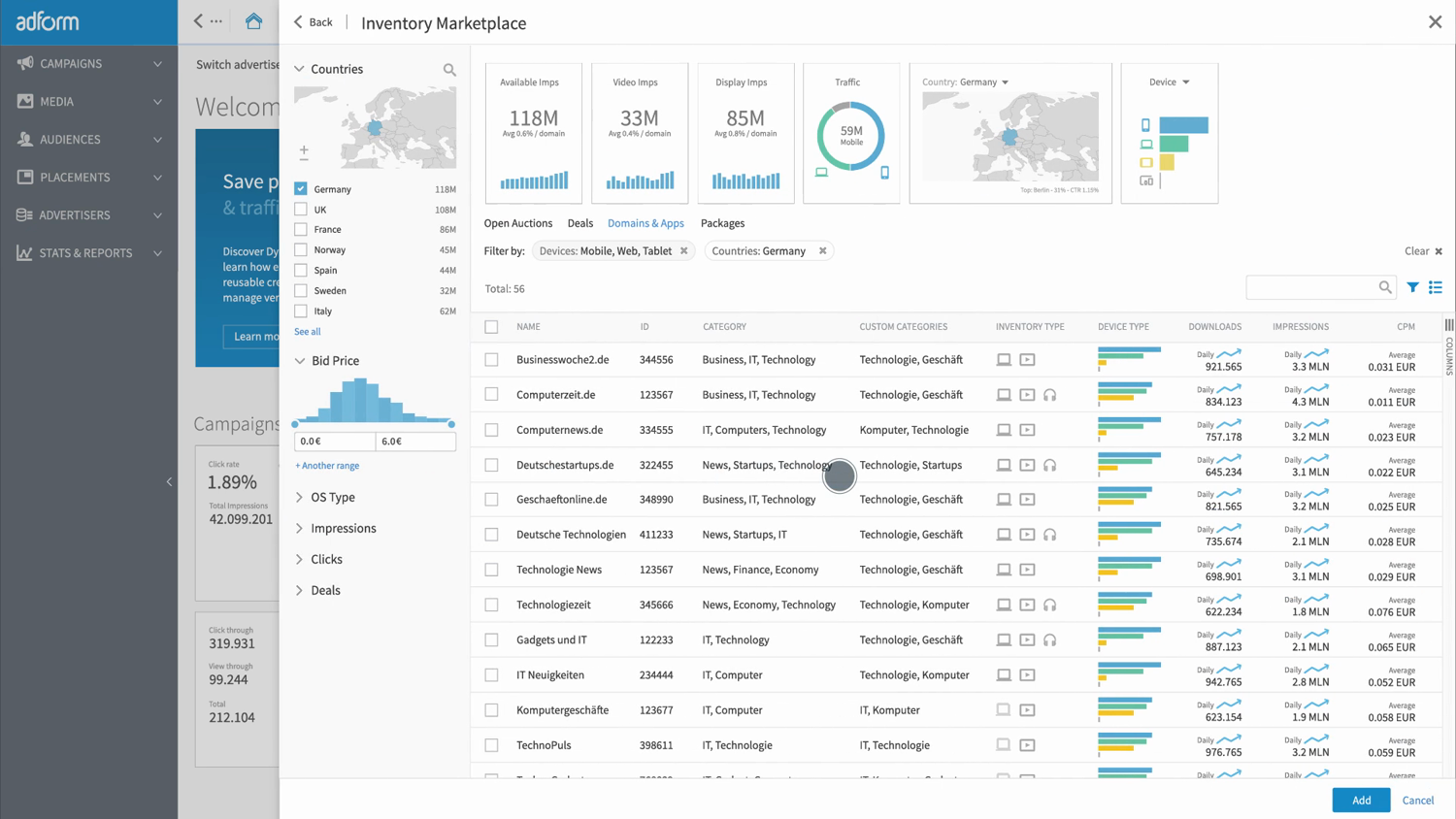
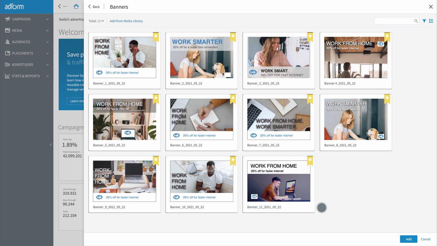
Applied across the platform, the framework produced FLOW — a single, consistent advertising workspace. The video above is its launch film; below are a few of the surfaces, all built from the same parts.
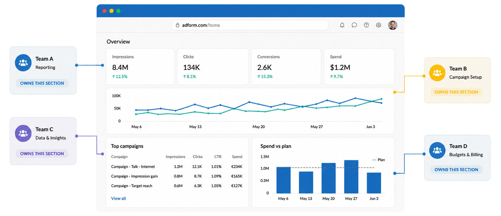
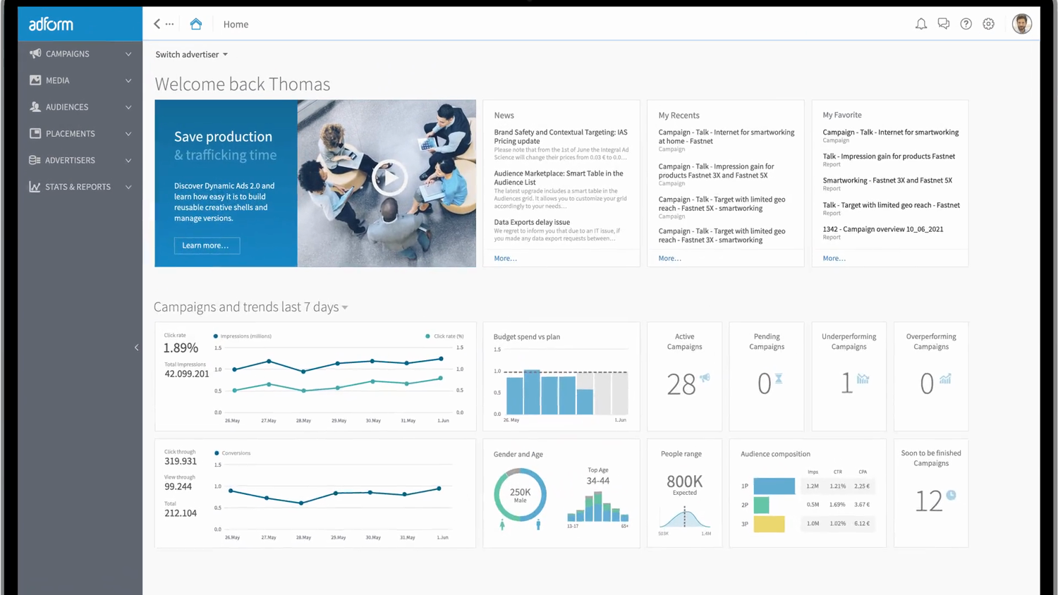
A workspace that adapts to who's looking.
Role-based permissions and a personalised dashboard surface the alerts, tasks, and numbers relevant to each person — instead of one screen trying to serve everyone.
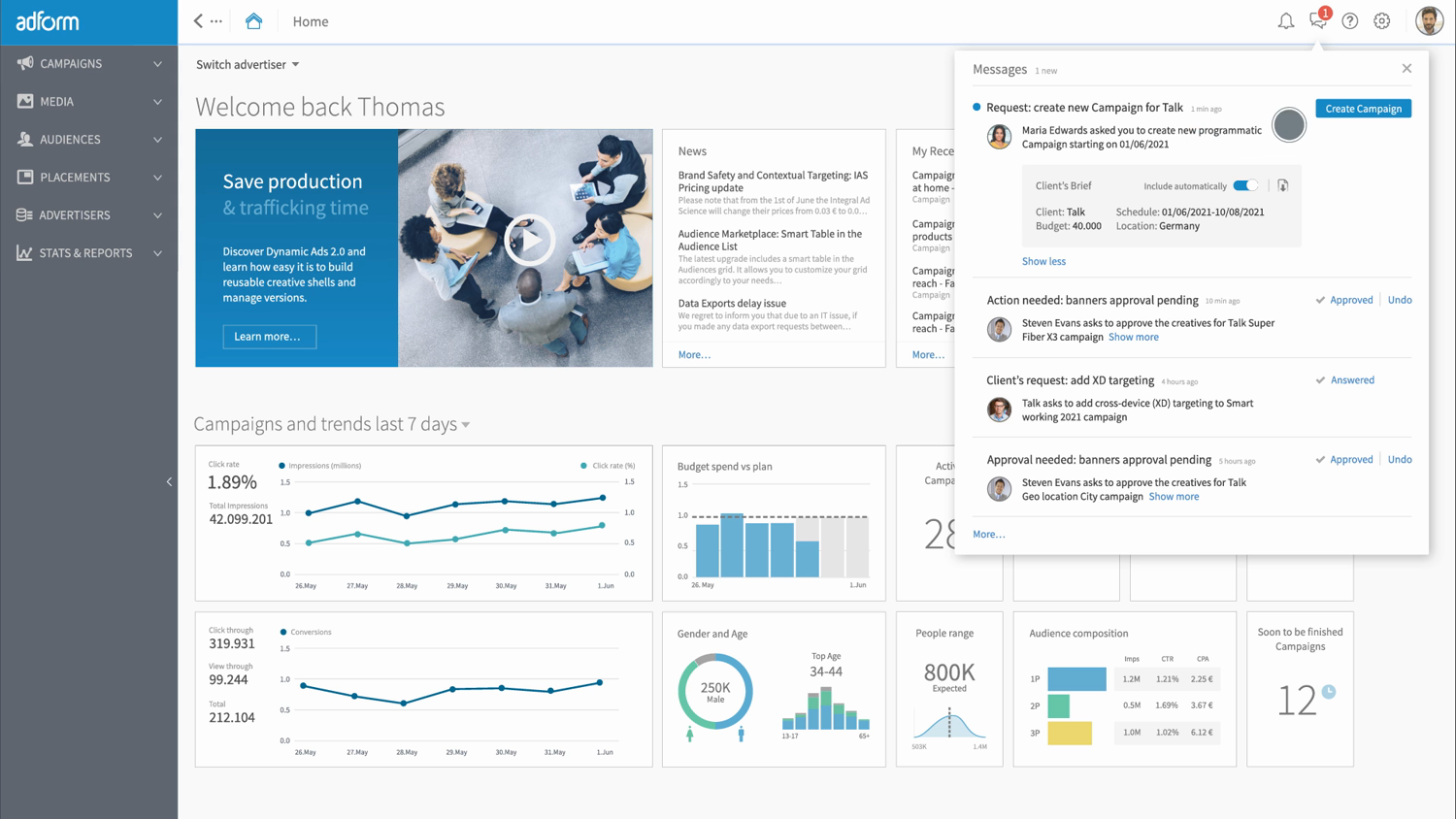
One place for what needs attention.
Approvals, requests, and system messages were pulled into a single, consistent panel — so the next decision was always easy to find.
The same patterns, end to end.
Setting goals and budgets, planning a campaign, reading results — each step used the same components and the same logic, so the platform felt like one product.

04 Recognition
Awarded for the UX.


05 Two tracks at once
I was building it, and helping others adopt it.
A framework only matters if people use it. So alongside the hands-on design work, a real part of the job was leadership — making the approach legible to everyone who had to live with it, and helping them make it their own.
- 01
Hands-on contributor
Designing patterns, components, and flows, and refactoring real screens against the framework.
- 02
1-1s & team meetings
Coaching designers and engineers on how to apply the system, one decision at a time.
- 03
Workshops
Running working sessions to align teams on priorities and turn ambiguity into direction.
- 04
Company-wide talks
Explaining to PMs, engineers, designers, and managers what we were doing and why it mattered.
06 The last chapter
Doing more, without losing the user's trust.
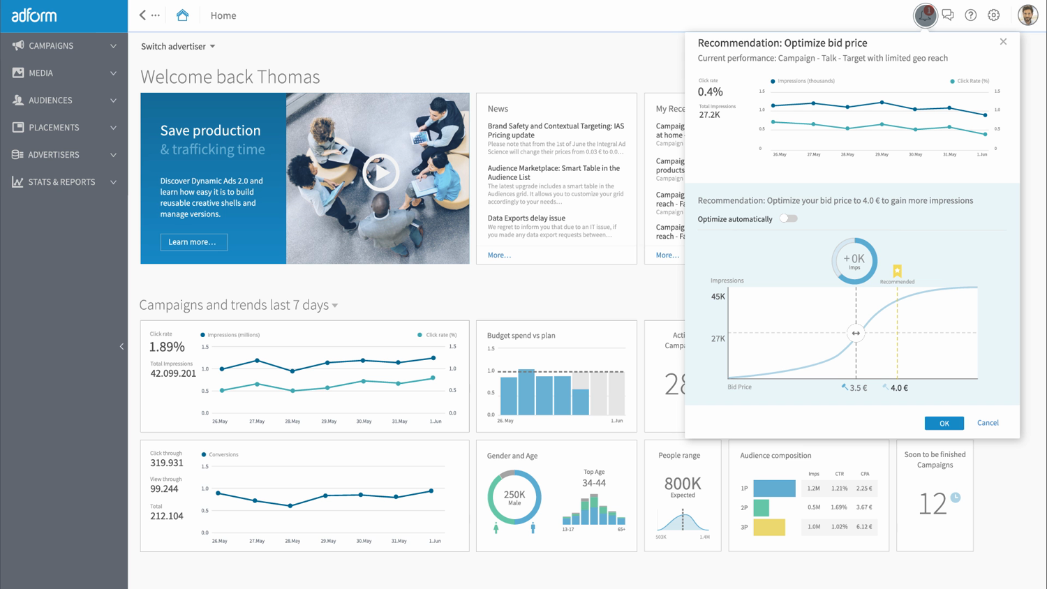
In my final year the work turned to where AI could take the platform — surfacing recommendations and automating the routine, while keeping the process transparent enough that people still understood, and trusted, what the system was doing. It's a thread I've kept pulling on since. Field note: Live-Model UX →
07 What the work left behind
It paid for itself
The strength of the platform's UX helped Adform raise investment, reach profitability, and win larger clients.
Red Dot & iF
The framework and the product it produced won a Red Dot Award and an iF Design Award for user experience.
A product that could move again
Teams could change a screen without breaking the next — the platform became maintainable and evolvable.
A shared language that lasted
Tokens, components, and patterns outlived any single project and kept design and code in step.
08 Reflection
The most useful thing design did at Adform wasn't a screen. It was a structure — one that let a large, complicated product keep moving without falling apart.
Seven years taught me that on a product this size, the design and the way teams work on it are the same problem. You can't fix one and ignore the other.

Have a large product that's become hard to change?